

You have a deadline for a presentation coming up. Your boss wants you to show how finances this quarter compare to the last. The easiest thing to do is open Powerpoint, throw your numbers on a few slides, and call it a day.
But your boss wasn’t happy with the last presentation done that way. It didn’t resonate with stakeholders and no one came away with actionable insights. That’s where charts come in.
“Most of us need to listen to the music to understand how beautiful it is. But often that’s how we present statistics: we just show the notes, we don’t play the music.”
Hans Rosling
Charts are highly effective at presenting information because they engage our pre-attentive processing, brain activity that occurs before our conscious, thinking minds kick in. It lets us rapidly and instinctually register attributes such as color, shape, size, orientation, and grouping in our visual field before making logical connections between them. In essence, it is the scientific reason why “a picture is worth a thousand words“. Charts that skillfully manipulate these pre-attentive attributes will engage readers at a deeper, knee-jerk level (without them even realizing it!)
In this post, we’ll break down how Dr. Chris Murray expertly uses the 3 pre-attentive attributes of color, size, and motion in his charts to show reduction in child mortality over 23 years.
1. Preparing the Slide
In the video that follows, Dr. Chris Murray’s goal is to demonstrate progress toward UN Millennium Development Goal #4: reducing worldwide deaths of children under 5. Let’s hypothetically imagine Murray was preparing for the presentation and came up with the following slide:
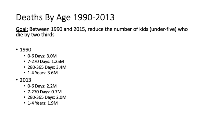
This slide is the kind your boss found to be un-insightful. While it contains all the important numbers and shows the trend of decreasing deaths, it does so entirely with bullet points of text. No immediate, intuitive observations “pop-out” for the audience because the slide is not optimized for pre-attentive processing.
When you are preparing for your presentation, it is completely fine to start out with a slide like this. But remember, incorporating visuals like charts in the final draft can make your conclusions crystal clear.
2. Presenting the Slide
Let’s continue our hypothetical example and imagine Murray got that feedback on his original slide. He works on revisions and decides to split his original text-heavy slide into two charts (which appear in his actual presentation):
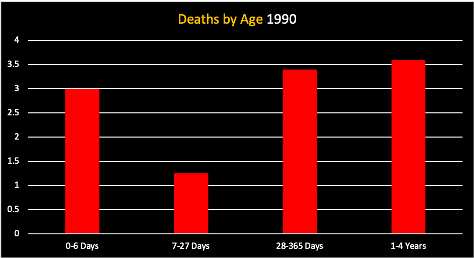
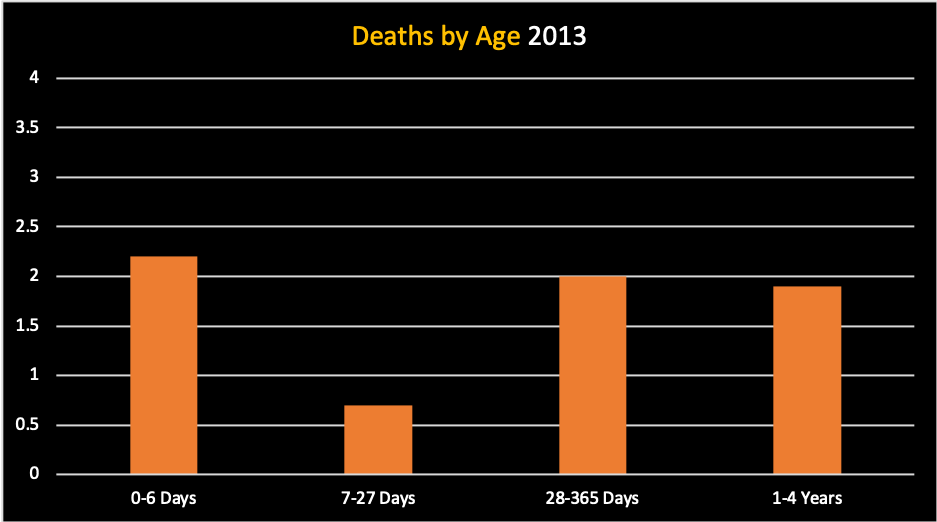
Notice how the message “pops out” within a few seconds of looking at the charts side-by-side. The information is exactly the same, but now uses 3 pre-attentive attributes to present that information effectively:
Attribute #1: Color
- The bold, red color of the “Deaths by Age 1990” chart immediately jumps out at the viewer, stressing how severe the death rate was at that time.
- By contrast, the milder, orange color of the “Deaths by Age 2013” chart indicates a lessening in the death rate’s severity after 23 years. The situation is still of concern (since we are not in the “green”), but considerably less alarming.
Attribute #2: Size
- The reduction in size of every bar from 1990 to 2013 indicates, at a glance, how much the death rate declined between those two years
Before getting to attribute #3, watch the clip below to get a sneak peek of all three pre-attentive attributes in action:
Presentation Clip 1
Attribute #3: Motion
- In his presentation, Murray uses animation to transform the “Deaths by Age 1990” slide into the “Deaths by Age 2013” slide.
- The animation dramatically shrinks the bars’ height from 1990 to 2013 and transitions their color from bold red to softer orange.
- By adding this extra visual flair, Murray firmly engraves the changes to bar color and size in the audience’s memory.
Summary
When creating your own presentation, follow these tips to achieve Murray’s mastery of pre-attentive attributes in slide design:

