

Your presentation is going really well. You have the audience engaged, hanging on to your every word … Until you put up the math equation slide. Then the eyes begin to wander. The feet begin to tap. And you can feel the energy just seep out of the room.
What happened? Was it the equation? No, it was just the way equations are typically presented – on a white slide in black font with lots and lots of text. It turns out the brain is poorly designed to process this kind of information. According to molecular biologist John Medina in his book Brain Rules, three days after seeing textual information, we can remember 10% of it. However, after seeing textual AND visual information, we can remember an astounding 65%.
If you need to present equations, statistics, or other complex information, there is always a way to avoid a text-heavy slide. Pictures, charts, and diagrams are great text alternatives. But above all, simplicity is your greatest asset. As author Emma Hill aptly put it:
“The first draft is black and white. Editing gives the story color.”
Emma Hill
Text-heavy slides are literally black and white. To make information come alive, it needs to be edited down and presented in a way that complements, not distracts from you and your delivery.
In this post, we’ll break down how Bill Gates expertly uses simplicity and visual aids to explain an energy equation for CO2.
1. Preparing the Slide
In the video that follows, Bill Gates uses an energy equation to explain climate change. Every factor in the equation represents a source of CO2 and Gates’ goal is to show what can be done to reduce CO2 production. Let’s hypothetically imagine Gates was preparing for the presentation and came up with the following slide:
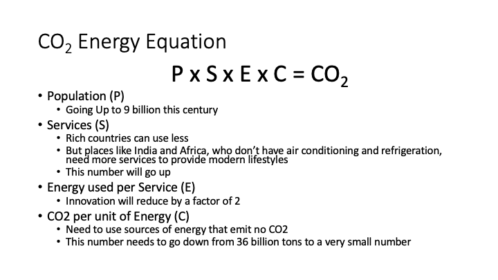
This slide is really helpful for him because it lists every point he is planning to make. But it is the complete opposite for his audience. It doesn’t help them to redundantly read through all that text, when he is saying it at the same time.
When you are preparing for your presentation, it is completely fine to start out with a slide like this. But remember – to make it come alive, it needs to be edited down and presented in a way that complements, not repeats your delivery.
2. Presenting the Slide
Let’s continue our hypothetical example and imagine Gates got that feedback on his original slide. He works on revisions and comes up with the following (which appears in his actual presentation):
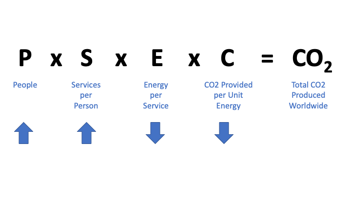
Notice how much was edited out. Every talking point was removed. The only things that remain are:
- The Equation
- Acts as consistent visual reference, since it is the central topic of the presentation
- A Short Description of each Factor in the Equation
- Acts as visual reference for the meaning of each factor, since the “P”, “S”, “E”, etc. in the equation are not self-explanatory
- Simple Symbols (Arrows)
- Indicate immediately if a factor increases or decreases, without using long sentences that say “increase” or “decrease”
Anyone can take 1 or 2 seconds to look at the slide and understand what is going on, as opposed to the previous version where it would have taken 1 or 2 minutes to read through and understand what was being said. Remember that the audience is looking at the slide while simultaneously listening to you. Their attention should never be diverted for more than a few seconds from you and your delivery.
Watch the clip below to see Gates present this slide on the CO2 energy equation:
Presentation Clip 1
Notice throughout the short clip that the camera cuts to show the slide only for a few seconds at a time, focusing instead on Gates and his explanations for much longer durations. Your slides should function in a live setting in the same way – remember that you are the star of the show, not your slide.
Summary
When creating your own presentation, follow these tips to achieve Gates’ mastery of simplicity and visual aids in slide design:


Really great example! Thanks for sharing.
If presenting the slide in PowerPoint, one further bit of polish is to literally type \times (rather than x), so Math AutoCorrect inserts a true multiplication sign. (Some audience members won’t notice the difference, but others will appreciate the sleeker look.)
You might be interested in what I wrote about reducing text when sharing a chart or other dataviz.
I’ve just discovered your blog, and I look forward to browsing more of your posts! Keep up the great work.
Thanks for the kind feedback Craig! That’s an excellent suggestion – every small bit of extra polish goes a long way to building audience trust and your own credibility. I also loved what you wrote in your article about reducing text when sharing a chart. Less is more, and the same principle applies to color. Pleasure to have also discovered your blog!