

You have a bunch of numbers, an amazing analysis, and a check-in coming up with your boss. While it would be easy to create a short report, you want to go the extra mile and put together a creative visualization. What graph do you choose? A line graph, bar chart, histogram, box and whisker plot… There are so many options and not enough time.
Here’s the good news. It’s incredibly fast and easy to create a graph in tools like Excel. In fact, check out this official tutorial that takes under a minute and even recommends what option to choose. But be careful – tools can do the majority of the work, but always require experienced discretion to be used correctly.
In this post, we’ll consider a practical example from Al Gore’s documentary “An Inconvenient Sequel: Truth to Power“, focusing specifically on how to visualize dramatic change over time.
1. Preparing the Slide
The bunch of numbers Al Gore used are given below:
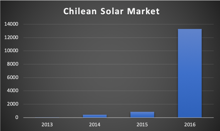
Chile’s Total Solar Capacity in MegaWatts (MW)
- 2013: 11 MW
- 2014: 402 MW
- 2015: 848 MW
- 2016: 13,300 MW
Chile’s solar capacity grew tremendously from 2013-2016, and Gore’s goal was to showcase the significant increase between 2015 and 2016. Let’s hypothetically imagine he was preparing for the presentation and began by putting the numbers in Excel to get its automatic chart recommendations:
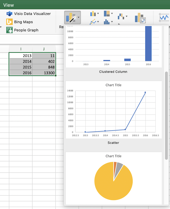
There are several recommended charts and three are shown in the image above: a bar chart, a line graph, and a pie chart. At first glance, the pie chart strongly catches his attention. He feels it best achieves the main goal of his analysis since the yellow area, representing 2016’s dramatic increase, is very prominently displayed. Confident, he sends a draft slide to his friend Walt Hickey, who replies with this Business Insider article.
The pie chart is easily the worst way to convey information ever developed in the history of data visualization.
Walt Hickey, Insider
Hickey’s primary point is that the pie chart is supposed to be really good at showing the relationship of parts to a whole, but fails remarkably because humans are very bad at comparing the sizes of slices in a circle. Consider again the pie chart Excel automatically created:
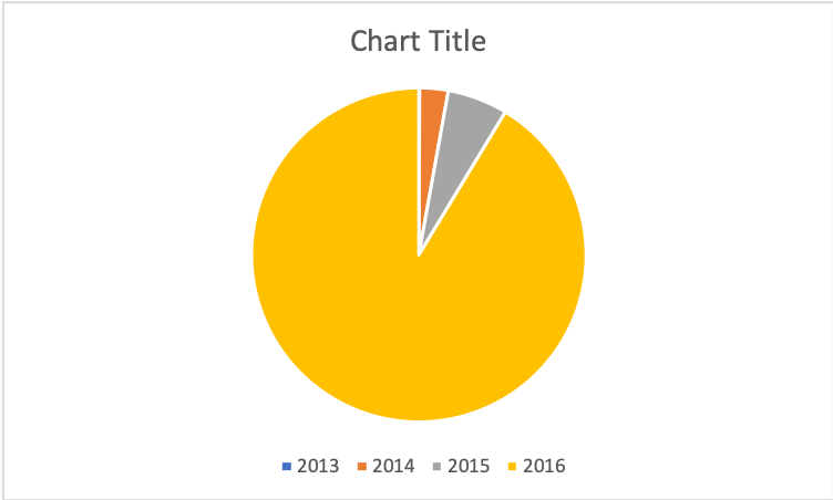
- What was the solar capacity (MW) in 2013? 2014? Even if you added labels, the chart would get cluttered very fast. One category (2013) isn’t even visible!
- How much greater was the solar capacity (MW) in 2015 compared to 2014? There’s no way to tell exactly – 2015’s slice could be two or even three times bigger than 2014‘s.
To top it off, the pie chart’s call to fame – showing parts of a whole – doesn’t make any sense for this data. The chart above seems to indicate that Chile’s total solar capacity was the sum of all the years: (11+402+848+13,300) MW = 14,561 MW. But that representation is misleading. Each year’s total capacity stands on its own and isn’t meant to be added to previous years. For example, 2013 had 11 MW capacity. And 2014 had 402 MW capacity. Chile didn’t have (402+11) MW = 413 MW total capacity in any year.
So the pie chart is out of the running. Let’s now look at the line graph Excel recommended:
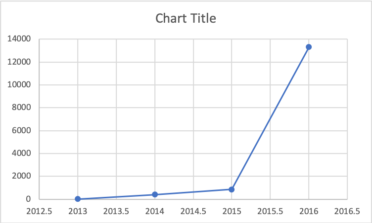
Addressing the same two questions for this graph:
- What was the solar capacity (MW) in 2013? 2014? Since this graph has axes, it is clear (even without labels) that 2013 ~0 MW capacity and 2013 had ~500 MW capacity.
- How much greater was the solar capacity (MW) in 2015 compared to 2014? It is clear that 2015 had about two times more capacity than 2014. Humans are much better at comparing vertical heights than slices of a pie.
But there is a problem. The bottom x-axis is using values like “2012.5”, treating the year like a continuous value (as if it were a metric like 2012.5 inches or 2012.5 pounds). This is straightforward to remedy with some additional tweaks in Excel’s Axis options. But for simplicity’s sake, let’s assume you want a graph with the least customization. Let’s look at the final recommended option – the bar chart, which turned out to be the one Al Gore went with in his presentation:
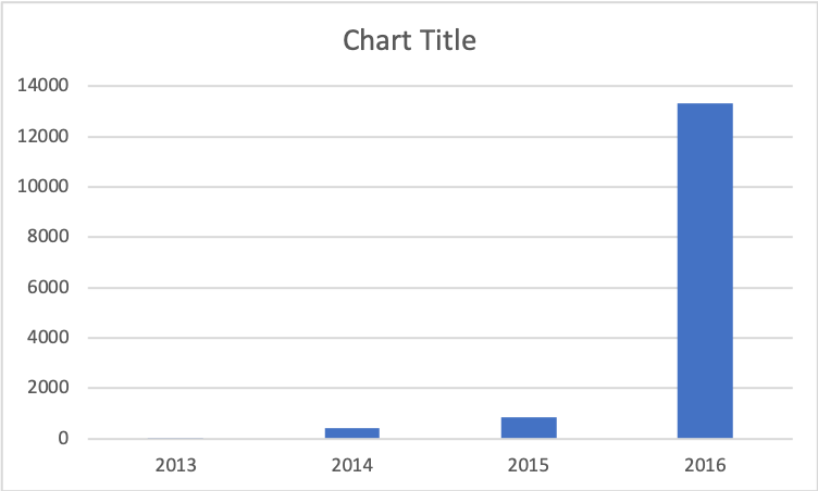
Just like the line graph, it is clear how to answer the same two questions. Thanks to the use of vertical heights and axes (which perfectly suit our needs this time), the value of each bar is clear, as well as its relative value compared to every other bar. But above all, the ultimate goal of this analysis – showing the dramatic increase in capacity between 2015 and 2016 – is abundantly clear. The height of the 2016 bar vastly exceeds that of the other three. And the bar chart prominently displays this dramatic increase without creating any misleading representations of the data like the pie chart.
After selecting a sleeker preset color scheme and filling in the title, the graph is nearly identical to the one Al Gore uses in his final presentation:
Watch Al Gore present this slide in the clip below:
Presentation Clip 1
The crowd’s audible enthusiasm confirms the bar chart was the right choice. What this example demonstrates is how critical it is to use a tool carefully. Excel originally recommended the pie chart because it had no idea about the meaning of the data. Only you have that context. While a line graph would have also been a suitable choice with small, additional modifications, the bar chart ultimately did a superb job of delivering Gore’s underlying message. And you can get that same reaction from your audience with only a minute’s worth of work in Excel.
Summary
When creating your own presentation, follow these tips to achieve Gore’s mastery of chart choice for slide design:

