

One of my biggest pet peeves with slides and data visualizations is ineffective titles.
Consider this: in data visualization tools like Power BI, as soon as you drag a field like “Population” and a field like “Years” into a chart, it will automatically create a title for you like “Population by Year”.
That kind of title might seem innocently, decently informative.
But actually it does your audience a great disservice. They will look at the chart and go, “Great, it’s showing Population by Year. But what about that is important? Why should I spend time looking at this and what exactly should I take away?”
In this article I will break down how to elevate your slide and data visualization titles, so that they help your audience out, instead of holding them back.
- Wait, Isn’t This Biased?
- Level One: Say What’s Going On
- Level Two: Say Where Specifically the Viewer Should Look
- Level Three: Say Why It Matters
- Summary
Wait, Isn’t This Biased?
First, I want to address the ethics of this approach. A common belief among us as technical professionals (myself previously included) is that being too explicit with our takeaways will unfairly bias our audience. From a scientific standpoint, we should let the data “speak for itself”, objectively.
But if you think about it, we are not completely objective at any point in the typical analytical workflow.
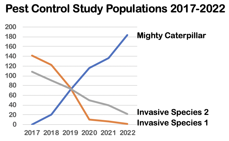
Let’s take the example we will use in this article of a 2017-2022 pest control study. There are two invasive species, called “Invasive Species 1” and “Invasive Species 2”, in our area of research. Starting in 2017, we introduced a natural predator called “the Mighty Caterpillar” to reduce those populations.
When you collect data for this study:
You are explicitly choosing what data is valuable and what is not. Rather than examining every single species in this area, you have simply and confidently selected only three species to research. To be fair, you can make a note of any specific criteria you’ve chosen.
When you create a dashboard of this study:
You are explicitly choosing what data is relevant and what is not. Rather than including charts of the Mighty Caterpillar height and weight, or the Mighty Caterpillar food consumption (which you know your audience doesn’t care about), you have simply and confidently selected only charts for population count and location. To be fair, you can make a note of what information was collected but excluded.
Therefore, when you have to present the results of this study:
You should also be fine explicitly choosing what takeaways are important and what are not. Rather than leaving it to your audience to look at everything at once, you simply and confidently state what they should pay attention to in the title. To be fair, you can make a note of any caveats, nuances, or limitations.
Every part of the analytics workflow involves some degree of subjectivity. As long as you are honest and comprehensive in your approach, you should have no reservations about being clear. Give the audience your clear perspective, as well as be clear with any disclaimers, and they can reach their own conclusions.
With that understanding, let’s dive into a chart from our 2017-2022 pest control study example and see how we can improve the title:
Level One: Say What’s Going On
Unfortunately this chart has the standard, “objective” approach to title writing: just stating what variables are being visualized.
To take it up a notch and let the audience know what’s important, consider saying what is in fact going on with those variables:
“Mighty Caterpillar Increases, Invasive Species Decrease”
If you still have reservations about putting the takeaway in the title, this is a wonderful beginning compromise. The data is still speaking for itself and you are adding no new interpretation of it – just making it clear what about the “Pest Control Study Populations” is of greatest value: the increasing and decreasing trends.
Level Two: Say Where the Viewer Should Look
But we can make it better. Within the whole graph, not everything is important. Consider highlighting in the title specifically where the audience should direct their attention:
“After 2019, there are more Mighty Caterpillars than Invasive Species”
Again, this adds no new interpretation of the data or any emotionality. You are simply describing what the data is saying, and pointing the audience to the most important part.
Whereas for the previous title “Mighty Caterpillar Increases, Invasive Species Decrease”, the audience’s eyes went all over the place, looking first at the “Mighty Caterpillar Increasing” line and then the “Invasive Species Decreasing” lines, now for this new title they look straight at the inflection point at 2019 where everything changes.
Bonus: to highlight the important area in the graph you mention in the title, check out this article on adding effective call-outs/annotations.
Level Three: Say Why It Matters
We’ve done significantly better than the original title “Pest Control Study Populations 2017-2022”
But it’s still unclear why I should care there are more Mighty Caterpillars than Invasive Species after 2019. Why not tell the audience exactly what that moment means:
“Success: Mighty Caterpillar Reduces Invasive Species”
You might justifiably feel this is biasing the audience. But remember you have exercised “bias” throughout the whole analytics workflow previous to this point, just in a more hidden way:
In the data collection step:
You implicitly told the audience the caterpillar and invasive species are the most important in the area by excluding other species.
And in the data reporting step:
You implicitly told the audience the population and location data are the most important in the study by excluding other metrics.
In the data presentation step:
You are explicitly telling the audience the reduction of invasive species is the most important message over other takeaways.
While presentation is indeed the most visible step, remember that it isn’t inherently more subjective than any other activity we execute. In fact, for a business audience seeking your guidance on what decisions to make and how initiatives are progressing, this kind of title is a lifesaver. Because now they understand immediately, without struggling to make sense of the data in the graph, that we achieved our objective and this is a positive story.
As long as you stand confidently by your choices in presentation, just as you stood by your choices in data collection and reporting, you can be clear about what you concluded and leave the final decision in their hands, transparently addressing any oppositions or follow-up questions that arise.
Bonus: for more information on how to make not just the title but the graph itself more effective, check out this article on how to present complex information.
Summary
Rather than just using a basic, descriptive title like “Pest Control Study Populations 2017-2022” consider upgrading it in the following ways to make the “so what” clear:
Level One: Say What’s Going On
Level Two: Say Where Specifically the Viewer Should Look
Level Three: Say Why It Matters
A busy manager or executive doesn’t want to waste their time figuring things out in a busy graph where nothing feels important. They want clear and efficient answers from the data. And it is our responsibility to facilitate their experience by confidently presenting takeaway titles in our slides and data visualizations.
If you’re looking for further guidance on how to speak with confidence and authority, reach out to me here.

