

Have you ever looked at a slide with so much information you weren’t sure where to start? We talked about this common pitfall in a previous post. It’s very easy to treat slides like a repository for notes or a substitute for a good outline. But remember: a good slide serves as visual support for your oral delivery. When you say something during a presentation, the slide should not repeat it. It should complement it by adding visual context. According to the official TED blog:
“Too often, I see slide decks that feel more like presenter notes, but I think it’s far more effective when the slides are for the audience to give them a visual experience that adds to the words.”
Aaron Weyenberg, TED UX Lead
Visual experiences, though, are not silver bullets. Images contain a wealth of information and sometimes it’s still not clear what the audience should pay attention to. One of the most effective solutions to this problem comes from Gestalt psychology. This science behind visual perception explains how our brains organize everyday visual stimuli into simple, meaningful patterns. One principle, in particular, comes in handy for the issue at hand: focal point. Think of a red square within a a sea of black circles. If you can make the most important part of your image stand out using arrows, markers, or other visual highlights, that’s where the viewer’s eye will immediately be drawn.
In order to implement the focal point principle, follow these 2 simple steps:
- Use 1 sentence to summarize your slide’s main takeaway
- Use an arrow, circle, marker, or other visual highlight to draw attention to the most important part of the slide, so that a viewer understands the main takeaway in a single glance
In this post, we’ll break down how the real estate company Redfin used these 2 steps to design the slides for its 2021 Inman presentation:
Slide Design Example #1: Sales
Redfin’s 2021 presentation showcased results from an anonymous survey about their real estate agents’ experiences. Consider a hypothetical presenter who needed to put a slide together on sales closed last year (2020) vs this year (2021). He puts the data for sales into Excel, clicks the recommended bar chart, and creates the slide below:
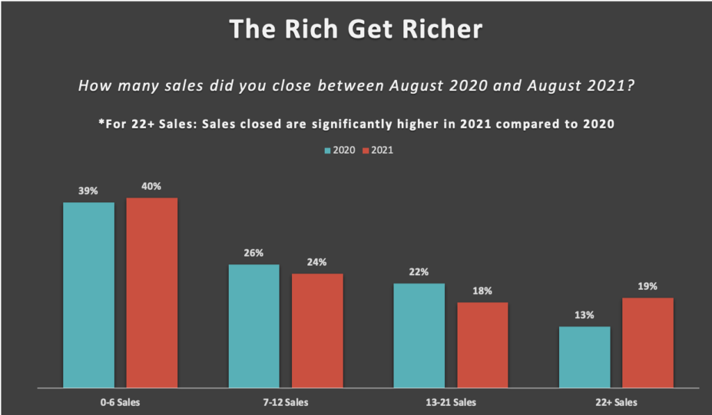
He feels he did a good job. A concise title is at the top, the underlying survey question is directly below to provide just enough additional context, and the slide isn’t too text-heavy. Following step 1, he succinctly summarizes the main takeaway: “*For 22+ Sales: Sales closed are significantly higher in 2021 compared to 2020”.
His coworker, who hasn’t seen the slide before, tells him the main takeaway isn’t immediately obvious. Without the extra line of text stating the main takeaway in words, nothing visually jumps out to indicate anything significant. Moving on to step 2, he decides to add a visual highlight in the form of a circle to draw the viewer’s attention directly to the “22+ Sales” category.
Stepping back and looking at the slide at a glance, he realizes that the visual now completely speaks for itself. The line of summary text can be removed because it adds no new information. See the revised version of the slide below, which was included in the final Redfin presentation:
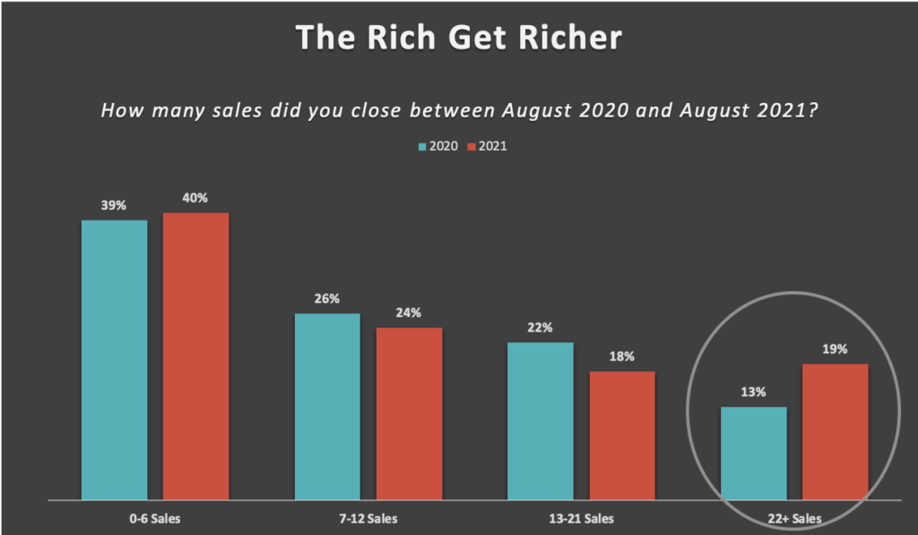
Due to the focal point principle, the viewer’s eye is immediately drawn to the last category “22+ Sales”. Its aberrant pattern becomes more noticeable – unlike the preceding 3 categories, “22+ Sales'” has a significantly larger red bar for 2021 compared to its blue bar for 2020 (just as the line of summary text previously stated). With the help of this small visual highlight, the slide’s message now stands crystal clear.
Slide Design Example #2: Income
Let’s now take a look at another slide designed by our hypothetical presenter centered around the topic of income. This is the original version:
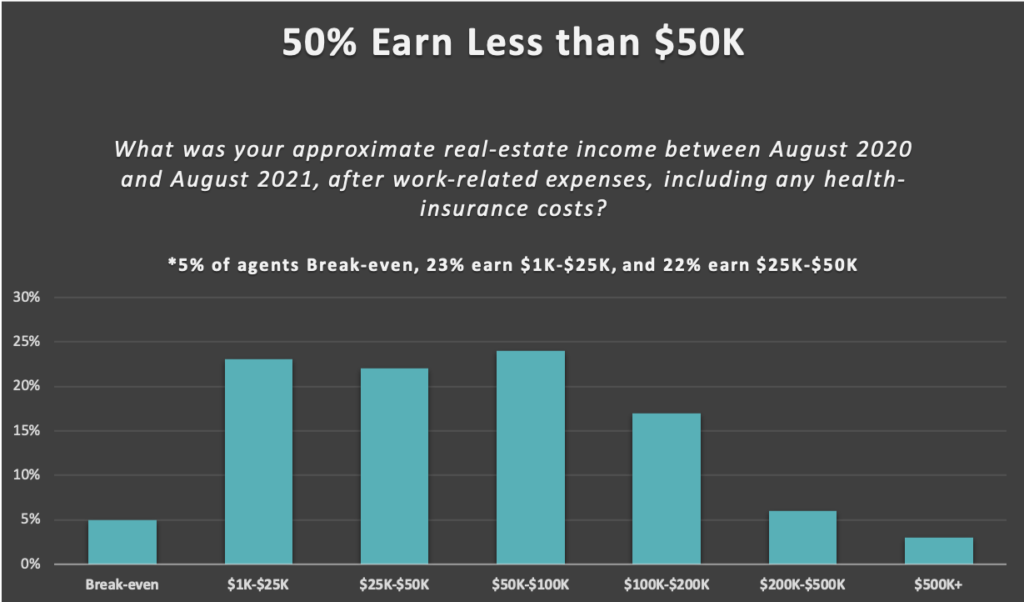
Following step 1, the main takeaway can be summarized by the title, “50% Earn Less Than $50K”. The line of summary text above the graph clarifies what this means: the first 3 bars correspond to 50% of agents, all of whom earn less than $50K.
Following step 2, the presenter wants to add a visual highlight to draw attention to the first 3 bars of the graph, which correspond to the “50%” of agents in the main takeaway’s claim. To do so, he adds a bracket around the three bars and a small “50%” label. Once again, the extra line of clarifying text becomes unnecessary because it adds no new information. Everything it says can be derived directly from the graph itself. The revised version of the slide, which appears in the final Redfin presentation, can be seen below:
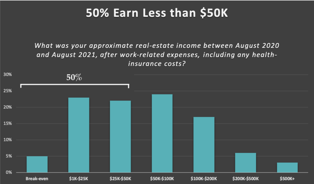
Thanks to the focal point principle, the viewer’s eye is instantly drawn to the most important 3 bars of the graph. It is now crystal clear exactly what the “50%” in the title means and exactly where “$50K” is. Once again, the visual highlight helps remove any ambiguity in the visualization so that it can stand on its own without additional lines of text.
Summary
When designing your own slides, use these 2 steps to achieve Redfin’s masterful use of the focal point principle:

