

The award for the most frequently-used, viscerally-despised chart of all time would probably go to…drum roll please…the pie chart. If you google “Why are pie charts bad” you will get an enormous diversity of articles ranging from “Some data on why pie graphs are bad” to “Pie Charts are the Worst” all the way to “What do you mean I’m not supposed to use Pie Charts?!” A lot of you are probably feeling the same way as the last article – what does make pie charts so bad? Well, we’re here to settle the debate once and for all.
According to the second article from Business Insider “Pie Charts are the Worst”, the issue boils down to a matter of visual perception. Scientifically, humans have poor ability to compare angles/segments of a circle. We have much better ability to judge attributes like length, and perceive changes in orientation. So while the purpose of pie charts is to show parts of a whole, we are not biologically wired to accurately evaluate all those slices against each other in the first place. A line chart, on the other hand, is an excellent alternative because it uses the orientation of lines to delineate trends in value.
But there’s more. While less oft-cited, here are 3 more reasons why pie charts are less effective than line charts:
- Too much Color
- Too much Clutter
- Not enough Clarity
In this post, we’ll explore those 3 topics in depth, breaking down how to correct LinkedIn’s use of pie charts in its Series B pitch deck.
1. Too much Color
Take a look at the slide below showing LinkedIn’s share of the market in February 2004:
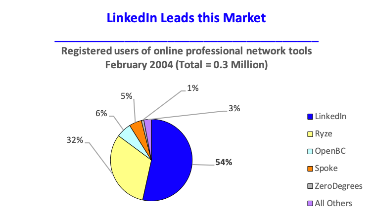
All pie charts like this one have an unsaid rule: every slice needs to be a different color. This is required in order to visually distinguish each slice within the pie. But look at the result when there are a large number of categories. The slide fails to focus the viewer’s attention on LinkedIn’s 54% market share because of the dazzling array of adjacent yellow, red, and blue. In particular, the bright yellow “Ryze” slice adds a tremendous amount of visual noise.
Taking the “Ryze” slice again as an example, notice how you figured out in the first place that “Ryze” corresponded to bright yellow. Your eye needed to go back and forth from the legend to the pie to match every color to each category. This is not an optimal user experience. There are too many colors and too many pieces of information in different places that make interpretation excessively difficult.
2. Too much Clutter
At this point I have to confess that I edited the previous slide from LinkedIn’s pitch deck. LinkedIn had the foresight to not include a legend, probably recognizing there were too many colors and categories to make its inclusion worthwhile. But my slight sleight-of-hand was designed to set up this next point. Look at LinkedIn’s (actual) pitch deck slide and see what they did to compensate for the absence of a legend:
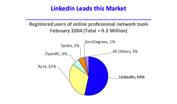
LinkedIn replaced the legend with an equally, if not more, cluttered-looking array of longer data labels. While the viewer no longer needs to interpret one color at a time, the visual noise created by the sporadic arrangement of text and leader lines again makes for a suboptimal user experience. In fact, if there were just a few more small categories squished into the top left of the pie, the leader lines for those slices would need to extend far out from the chart to avoid overlapping other data labels. Then we would be back to square one. The viewer would once again have to look back-and-forth from one side of the image to the other to interpret what each slice represented.
3. Not enough Clarity
The final pie chart pitfall we will explore can best be summarized in a quote by data visualization pioneer Edward Tufte:
“[Pie] charts are bad and that the only thing worse than one pie chart is lots of them”
Edward Tufte
LinkedIn’s pitch deck actually used 2 pie charts to illustrate its point about the company’s growing market share. Notice how challenging it is to compare the slices of the left pie with those of the right pie. More specifically (ignoring the numerical data labels), see if you can answer the following questions from a purely visual perspective:
- Is the OpenBC slice on the left the same size as the OpenBC slice on the right?
- Is the Spoke slice on the left 2 or 3 times the size of the Spoke slice on the right?
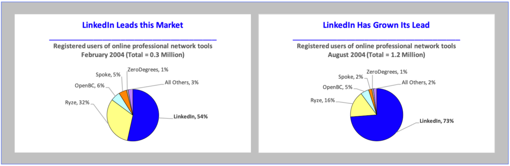
The reason for the interpretive difficulty is, once again, humans’ poor perception of angles/segments of a circle. On top of that, pie charts have no stable reference line. With the exception of the dark blue LinkedIn slice and light purple “All Others” slice, which are anchored to the 0 degree mark, all other slices have fluidly positioned borders. It is impossible to line up the yellow Ryze slice on the left, for example, with the yellow Ryze slice on the right because there is no consistent, fixed border between the two images.
But at this point I must confess that I again edited the image above. LinkedIn’s actual pie charts were not shown in a single slide like they appear to be here. They were shown on separate slides, making visual comparison impossible to begin with. The only thing the viewer would be able to remember after seeing the 2 slides in sequence would be LinkedIn’s slightly larger dark blue slice. All the other (potentially important) details would be lost.
Let’s see how we can solve these issues of clarity by combining the 2 pie charts into 1 single line chart that cleanly, efficiently, and unambiguously delivers the same message:
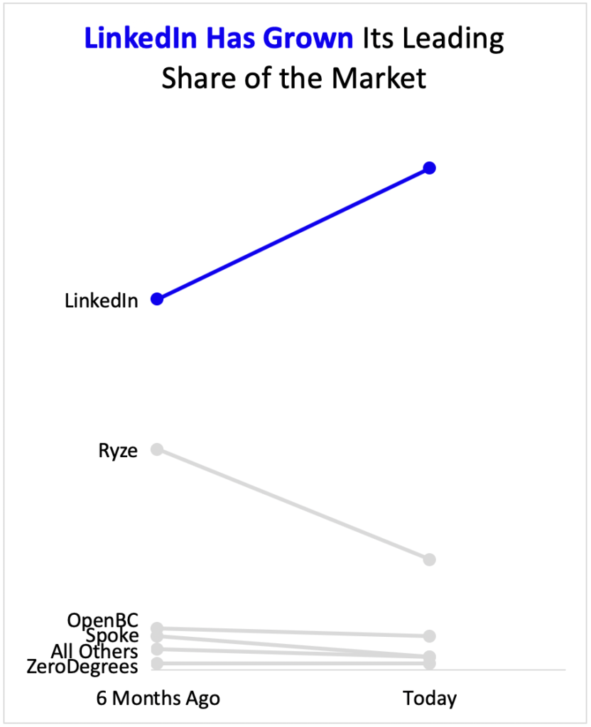
Let’s go through each of the 3 previous issues and how this graph solves them:
1. Color: Immediately the first thing you notice is the sparing use of color. Only two are used: light grey and dark blue. Due to the strong visual contrast, the light grey lines sink into the background. This is desired since their role is supplementary context. On the other hand, the dark blue line for “LinkedIn” pops out at the viewer as the most important part of the slide. This is a crucial emphasis because the slide deck’s purpose is to pitch LinkedIn to potential investors. We want to emphasize how LinkedIn is the only company with an increasing share of the market.
2. Clutter: The second thing you notice is the dramatic reduction in visual noise. Unlike the pie charts, which had a lot of clutter in the form of data labels and leader lines, the line chart has clearly and cleanly-labeled categories. There is no need to look back-and-forth across the image to figure out what everything represents.
3. Clarity: Lastly, the line chart is able to capture in one view what originally required 2 pie charts. Remember that the central message of those original 2 charts was the following: from 6 months ago to today, LinkedIn has grown its leading share of the market. Stretching that message across 2 separate slides made for a disjointed viewer experience, since they were unable to compare the size of LinkedIn’s share between those two points in time. Now with the line chart, the viewer can see LinkedIn’s trajectory of growth, along with the downward trajectory of each of its competitors, all in a single glance.
Summary
When designing your own slides, use these 3 tips to avoid the pitfalls of color, clutter, and clarity common to pie charts:

