
If you prefer video content over text, I explain this material with fun, musical examples in my YouTube video.
I’ve seen great slides miss one ingredient that instantly sours their impact: a poor title.
In this article, I break down why the title is so important and how to craft a great one.
What Not To Do
Take a look at this slide and count how many seconds it takes to see its point, its “so what.”
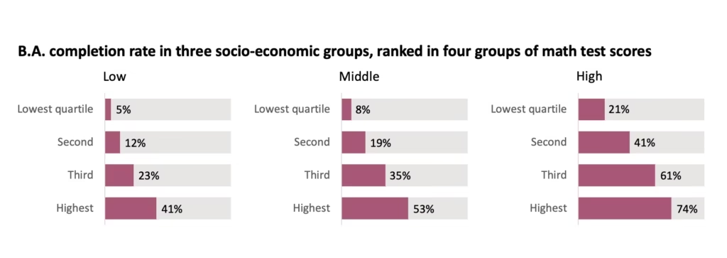
Here’s how long it took me, step by step:
- 2 seconds: I read the title and don’t see the point. All I see is what different variables are present.
- 2 seconds: I try to look at the charts to figure out what the point is.
- 1 second: I see three socio-economic groups, “Low, Middle, and High”, corresponding to the “three socio-economic groups” in the title.
- 4 seconds: I see the colored portion of each bar, corresponding to the “B.A. completion rate”. I realize: the “High” socio-economic group generally has a higher completion rate than the lower socio-economic groups.
- 4 seconds: I finally see the “four groups of math test scores”: “Lowest quartile”, “Second”, “Third”, “Highest”. I realize: the “highest” quartiles have the highest completion rate compared to the lower quartiles.
- 3 seconds: Ok, it seems this is the chart’s point: the higher the socio-economic group and quartile you’re in, the more likely you are to complete your B.A.
Look how long that took: absolutely unacceptable.
What To Do
Check out how American economist Susan Dynarski presents the same slide. You only need to watch about a minute from the video below to get a sense of Susan’s technique.
This is the slide Susan presented:
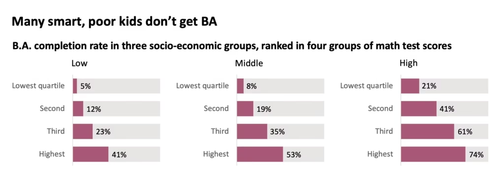
In one second I see the point, brandished proudly at the top of the slide in a short, snappy, jargon-free sentence: “Many smart, poor kids don’t get BA”. I immediately understand why Susan is showing this slide and why this data matters.
That’s exactly what a presentation should do: save the audience time and reduce their cognitive load.
Summary
Every slide you make should have a concise title – readable in a second or less – that conveys the point or “so what”. The subtitle (if applicable) should contain more detail about “what” is being shown, for reference.
By organizing slides in this format, you make the audience care first, then deepen their understanding.
If you’re looking for further guidance on how to differentiate your communication skills and stand out in the workplace, take my free self-assessment.
I’m writing a book on thinking quickly, speaking clearly, presenting convincingly, and supercharging your executive presence. My current focus: a section on how to properly rehearse for a critical presentation. This will be a deep-dive into every step to take, in the days leading up to your big day, to make sure you look and feel your best.
Follow me on LinkedIn for more updates on the book and its release!