

Text-heavy slides are attention-snappers. They instantly reduce attention to zero. Because audiences stop listening to you and start reading the screen. Philippa Leguen de Lacroix put it very well in her LinkedIn article:
For every person, reading is like listening to a voice inside your head reading out-loud…[When] listening to themselves read, your audience will struggle to listen to you, the presenter. We can’t listen (properly) to two sources simultaneously.
What I’m about to say may be shocking, but tables suffer from the same problem. You might argue, “Aren’t tables data visualizations? Aren’t we always told to replace text with visuals?” Yes and no. Technically, tables “visualize” data. But in practice, they are not “visualizations”.
Visualizations engage our pre-attentive processing – the instinctual, gut reactions we have to visual attributes like color, size, and grouping. In a previous post, we talk about how pre-attentive processing is so much more effective than text because viewers simply “get the message” without needing to think or read about it.
Bar charts, line charts, and other visualizations do just that. Bar size immediately reveals the highest category. The grouping of points into lines immediately reveals emerging trends. But tables? They are rows and columns of plain numbers, just as ineffective as paragraphs of text.
As this article on tables vs graphs discusses, we actually read tables just like we read text: left to right, and up and down. Tables are meant for audiences who want to meticulously dig in and derive insights on their own, not for an audience simultaneously listening to a presenter.
The solution is converting tables into “real” visualizations, visualizations that condense data into a clear, concise story easy and immediate for the audience to understand. And you can do all that in 3 simple steps:
- Summarize the story of the table’s data in one sentence
- Reduce the table to only columns/rows relevant to the story
- Visualize the simplified table’s story using a bar chart, line chart, etc.
In this post, we’ll talk about a table Uber used in its 2008 pitch deck and how to visualize it effectively using the methodology above.
Overview: Uber’s Market Expansion
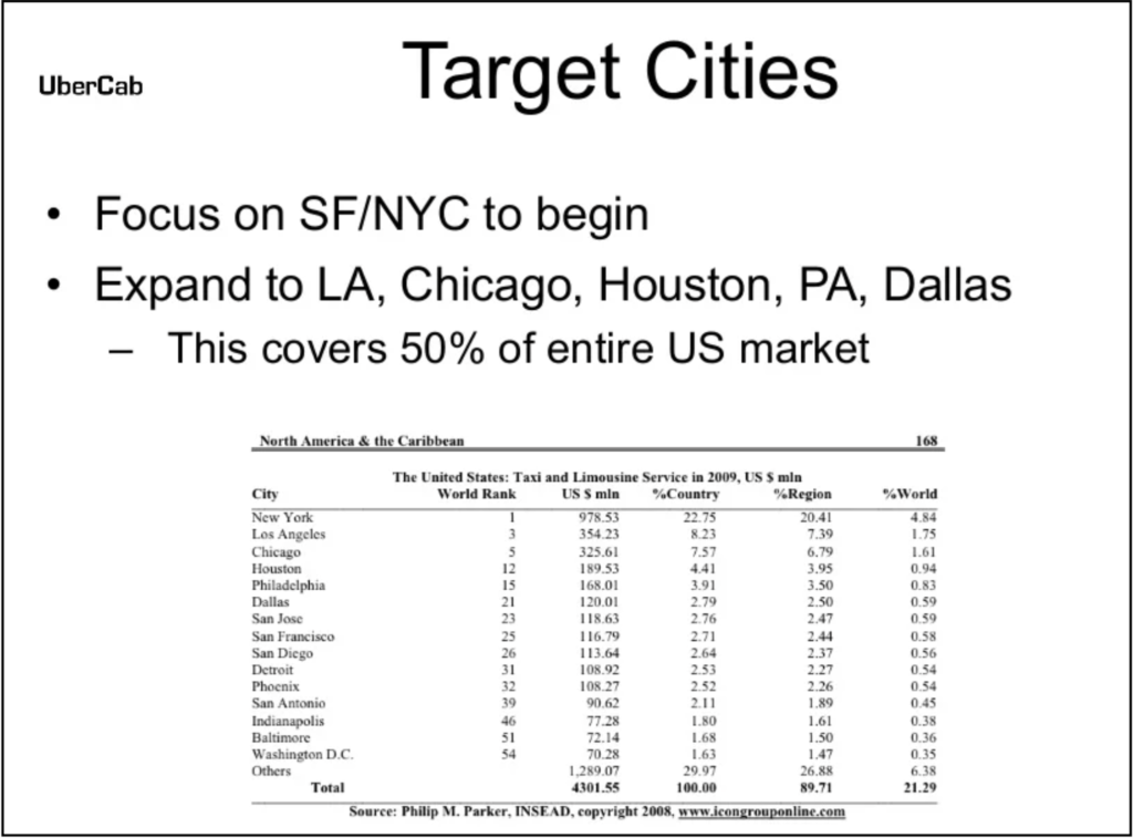
If I had to describe the design of the slide below in one word: “overwhelming”. The table is enormous, with 16 rows x 6 columns = 96 different cells to look at all at the same time, with no clear pattern, trend, or easy way of figuring out what the table is there for. Are we supposed to read up and down all the columns? Only certain ones? Which rows are the most important?
Let’s see if we can improve this table using the 3-step methodology and convert it into an engaging visualization.
Step 1: Summarize
Step 1 of the process is “Summarize the story of the table’s data in one sentence”. Uber has already done this for us, with its two introductory bullet points. In one sentence the story is:
“Uber will target SF and NYC first, eventually expanding to LA, Chicago, Houston, PA, and Dallas to cover 50% of the US market”
Step 2: Reduce
The authors of the slide probably included the full table (from what appears to be a book) in order to lend authority to their claims about Uber’s 50% market share. But the table’s overwhelming amount of encyclopedic information has the complete opposite effect by disengaging the viewer. Let’s reduce the table’s contents to the bare minimum needed for our story.
Starting with the columns: our story includes city names and percentages of US market share. Therefore, we only need to keep the “City” column and “% Country” column. That’s it. We don’t need the “World Rank” or “% World” columns because our story is only about the US. We don’t need the “US $ min” column because we’re not talking about money. And we don’t need the “%Region” column because we’re only looking at national percentages.
Moving on to the rows: our story only talks about SF, NYC, LA, Chicago, Houston, PA, and Dallas. Therefore, we can remove all the other cities in the table. You might argue (and rightfully so) that all the city rows are needed for the percentages to add up to 100%. But remember: our story is not about % constituents of the total US market. Our story is about % constituents of Uber’s share of that market. By removing the unnecessary cities, we can remove unnecessary noise distracting from the central story we really want to tell.
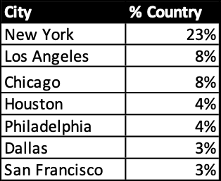
The simplified table appears as below:
Step 3: Visualize
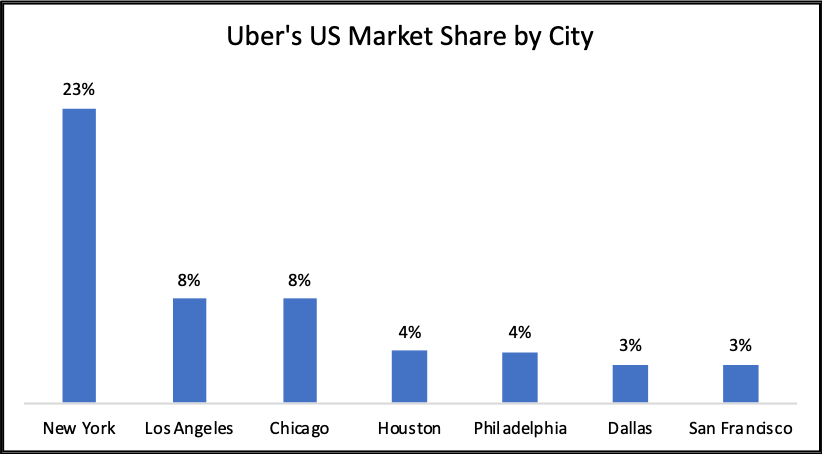
There are many chart options for the visualization step. A pie chart may come to mind since all the values are percentages. However, the pie chart is in fact a poor choice because all the percentages do not add up to 100%.
Let’s try a bar chart instead since we’re trying to compare values from different categories:
Recall that our story is:
“Uber will target SF and NYC first, eventually expanding to LA, Chicago, Houston, PA, and Dallas to cover 50% of the US market”
This is a perfect example of how direct translation from a table to a visualization is often insufficient. The “50% of the market” element is not strongly suggested. The expansion over time from 2 cities to a total of 7 is also absent from the visual entirely. Additional manipulation is required to convey the story we want to tell.
Step 3a: Clarify “Expansion”
Let’s tackle these missing elements one by one. First, the expansion to new cities. This is tricky because the table does not contain this information. So it isn’t possible to create one graph with years/months/dates plotted over time.
To work around this, let’s clearly break down what we need to show expansion:
- The “before” state must have 2 cities
- The “after” state must have all 7 cities
- The original 2 cities must carry over from the “before” state to the “after” state
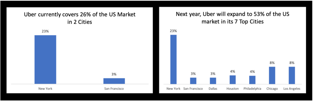
The best way to address these requirements is using two graphs, one to represent “before” and the other to represent “after”:
Definitely a step in the right direction. The viewer can clearly see a transition between the two different states of Uber’s business plan. But to go from good to great, we want to use all the tools in our toolbox to make the story immediately apparent. As per our earlier discussion, pre-attentive attributes are just the tool to trigger instinctual visual pattern recognition. See the revision below:
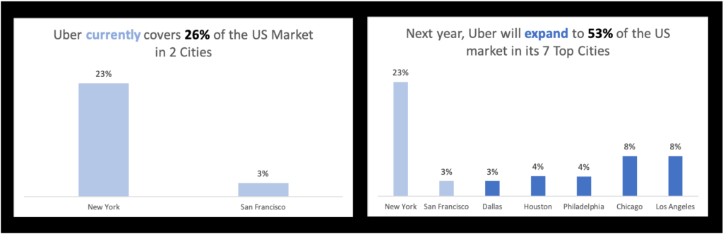
One small tweak of the pre-attentive attribute of color has made a world of difference to the visualization’s story. In particular, the requirement that the two original cities carry over to the “after” state is much more visible.
Light blue is color-coded to the word “currently” in the left image’s title and the two cities of New York and San Francisco. In the right image, darker blue is color-coded to the word “expand” and its corresponding 5 new cities. The contrast between the two colors emphasizes the transition over time, with the lighter color representing more faded data from the past.
Step 3b: Clarify “50% of the Market”
But we can do even better. Now that the expansion element from our story is clear, we need to concretize the “50% of the market” part of the story. The viewer could technically add up all the bars’ percentages and confirm the title’s claim that 53% of the market is covered in the future state. But our job is to facilitate the viewer’s experience as much as possible.
Let’s clearly break down what we need to show “50% of the market”.
- The “after” state needs a visual indicator that Uber covers 53% of the market
- A similar visual indicator is also needed for the “before” state (showing its total of 26%) to highlight Uber’s growth in total market share
The visual indicator we need could be an additional “totals” bar added to each graph. But it might confuse some viewers if all the bars represent city percentages except for an anomalous one at the end showing an aggregated sum. There needs to be a different way to visually distinguish the “totals” visual indicator from the rest of the bars. Let’s try using a line:
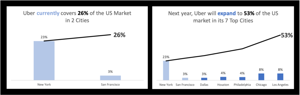
The line visual indicator achieves two goals:
- It is visually distinct from the bars so there is no room for confusion about what bar represents a city and what bar represents a total
- It is a “running sum” line, so it gradually increases as you move left to right as more and more city percentage values get added to it, until the grand accumulative total of 53% over the last bar. This effectively represents how all the bars contribute to Uber’s total market share.
Let’s look at our story again:
“Uber will target SF and NYC first, eventually expanding to LA, Chicago, Houston, PA, and Dallas to cover 50% of the US market”
The final design above achieves every critical element of the story. We can see that Uber will cover “SF and NYC first” from the left image. We then see that Uber “expand[s] to LA, Chicago, Houston, PA, and Dallas” from the right image. New York and San Francisco are retained from left to right in that expansion, underscored with the use of color. And the growth to “50% of the US market” is demonstrated by the “running sum” lines. Their accumulative totals of 26% and 53% on the left and right, respectively, allow the viewer to contrast the size and composition of Uber’s market now and into the future. The work is done.
Summary
When designing your own slides and considering how to more effectively represent data from tables, follow these 3 steps to convert them into engaging visualizations:
1. Summarize the story of the table’s data in one sentence
2. Reduce the table to only columns/rows relevant to the story
3. Visualize the simplified table’s story using a bar chart, line chart, etc.


this is really useful and simplyfies the data visualisation concept!
Thanks for the feedback Sai, really glad the article was helpful!