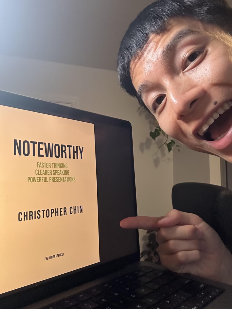
This is Episode 5 in my book writing journey. In case you missed the previous entries, here they are:
- Episode 1: How I Planned My First Book: The 3 Biggest Challenges
- Episode 2: How I Completed My Book’s First Draft: The 3 Biggest Gaps
- Episode 3: How I Finished My Book’s Manuscript: The 3 Biggest Edits
- Episode 4: My Book’s Professional Visual Design: The 3 Step Process
As a founder and CEO, I’ve thought long and hard about what makes people trust me – enough to follow me on social media, and enough to hire me as a coach or trainer.
My conclusion: everyone judges a book by its cover.
People work with me because of my presence – my videos, my writing in high profile publications, the success I’ve had with clients from companies like Google, Meta, and Amazon. That’s why my book needed a cover that was nothing short of extraordinary.
In this blog I break down the 3 biggest revisions my designer, David Ter-Avanesyan, and I agreed on to create a cover I am intensely proud of.
Revision #1:
Finding the Concept
I prepared a brief for my designer outlining everything I was looking for: something clean, minimal, timeless – driven mostly by a compelling font and simple, representative visual. Since my book was about the hidden music behind great communication, my designer sketched the following:
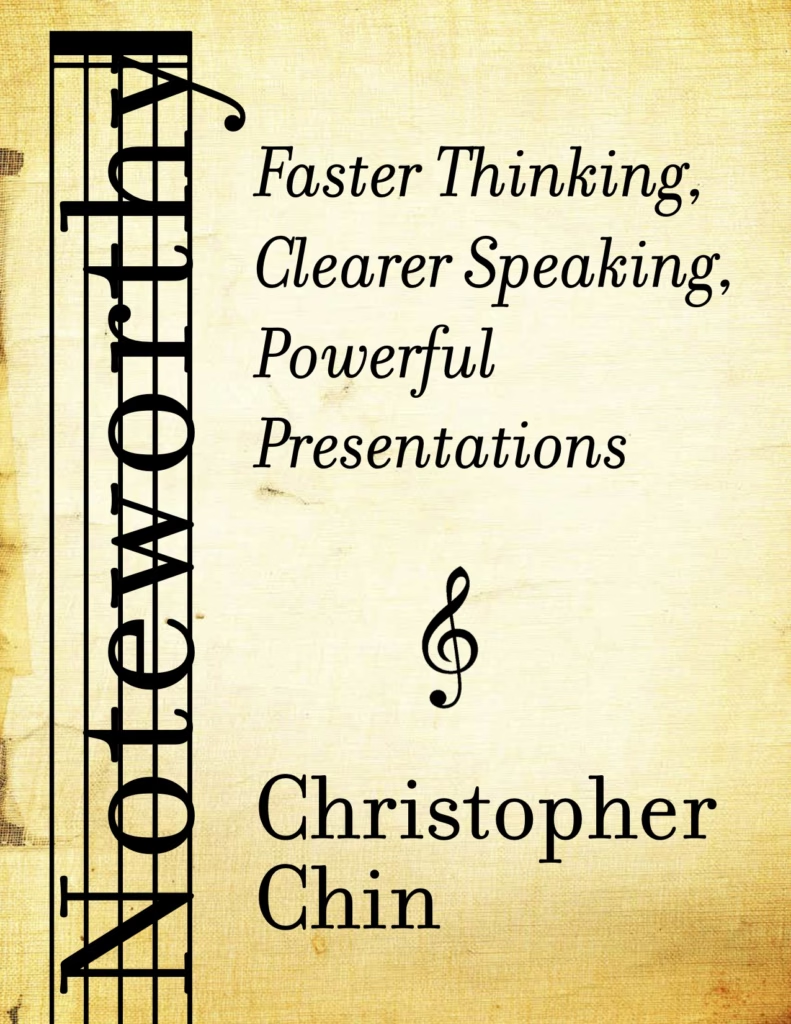
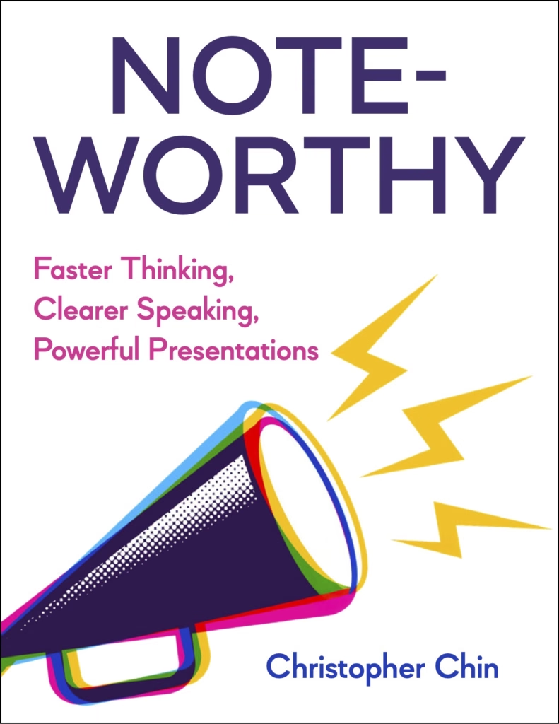
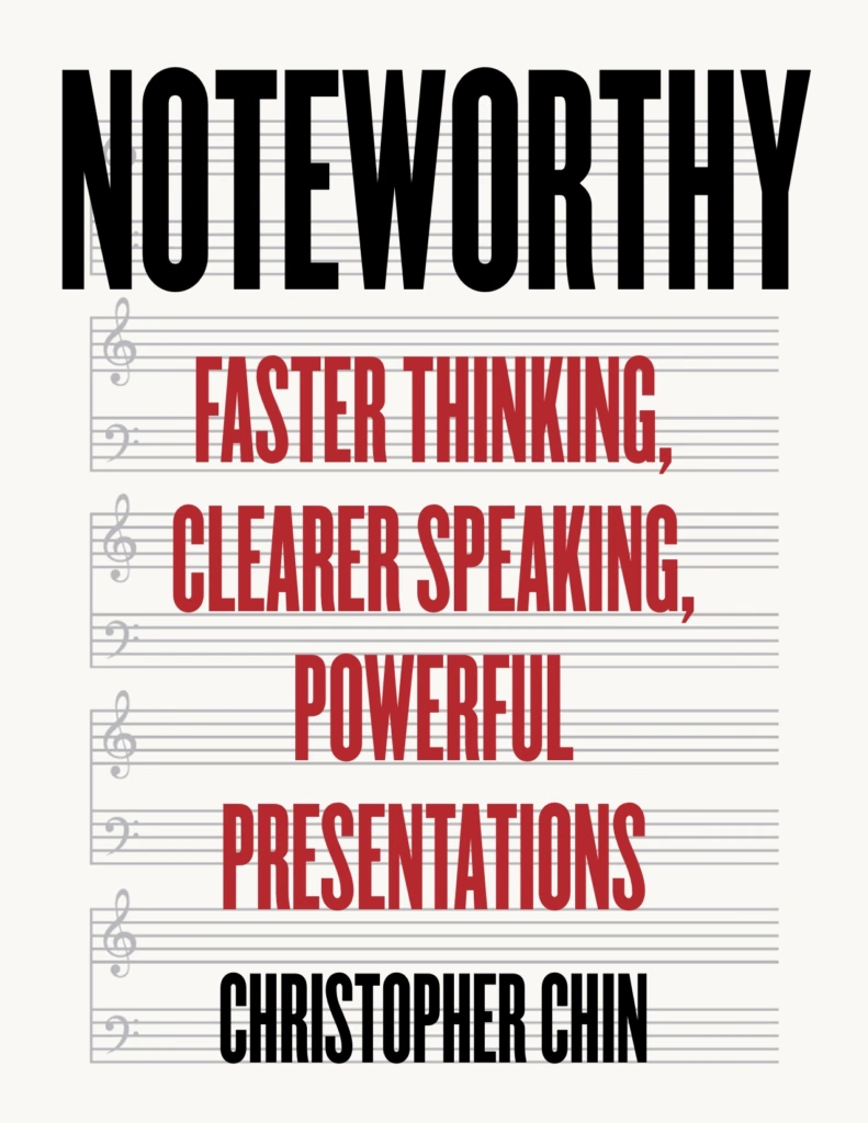
I quickly realized what I did and didn’t want. I didn’t want music on the cover. Because I wanted the reader to know – even at a distance in a bookstore – that this was a book about public speaking.
But I also didn’t want the cover to look like other public speaking books, which also featured megaphones or microphones. I wanted there to be something subtly musical or curiously unique about my cover that would draw people in.
Revision #2:
Going Back to Basics
After my designer sent a few more revisions, I was warming up to the direction – the visual was more iconic, and the colors were matching my intended tone:
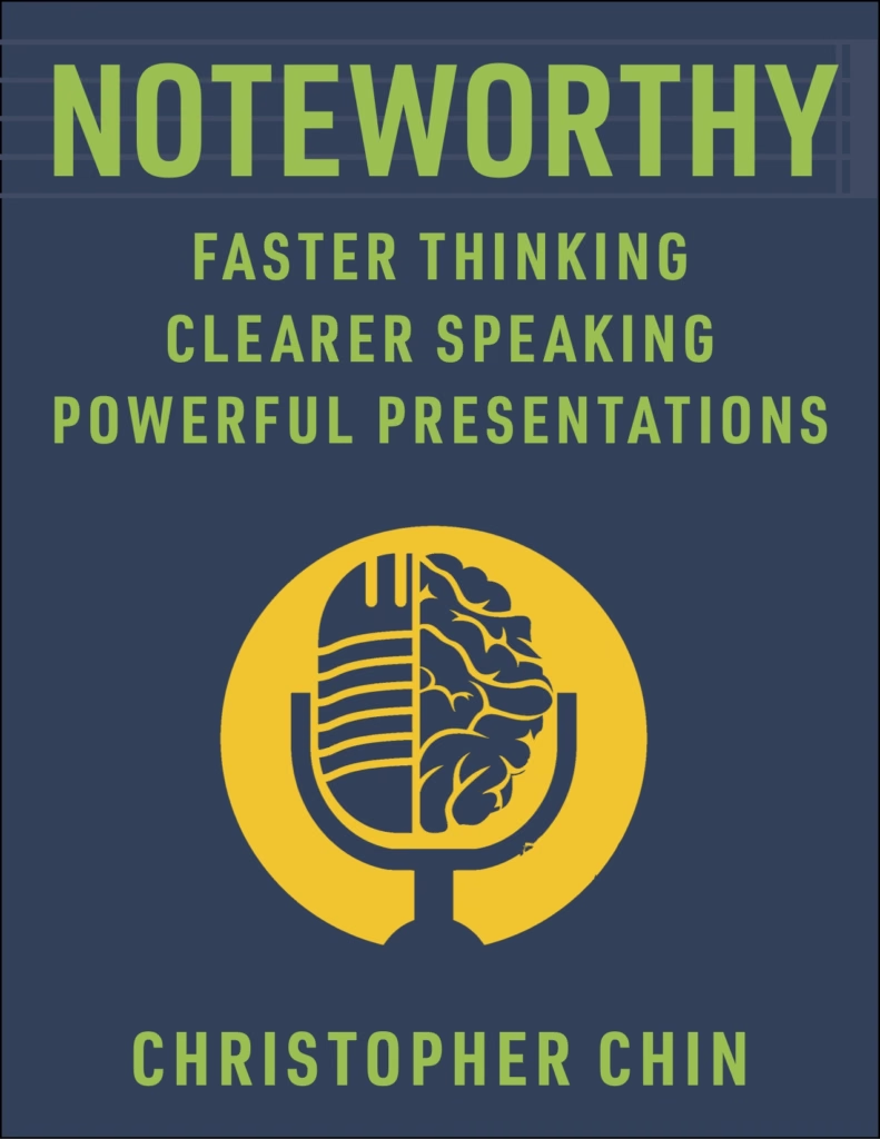
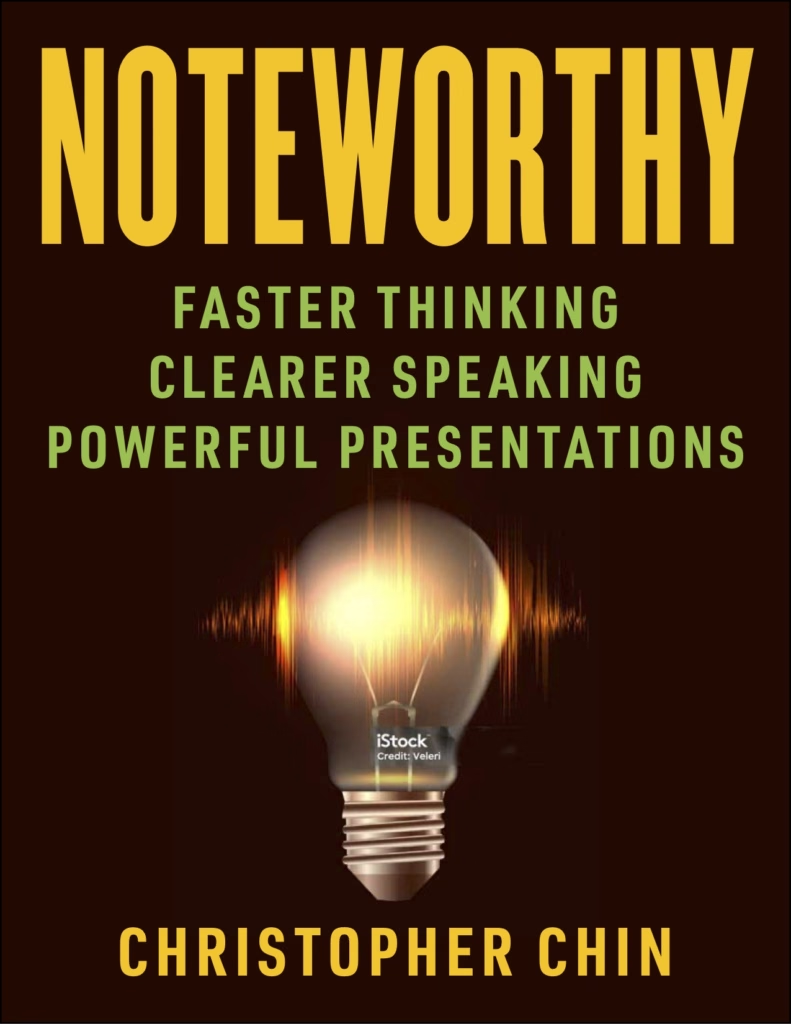
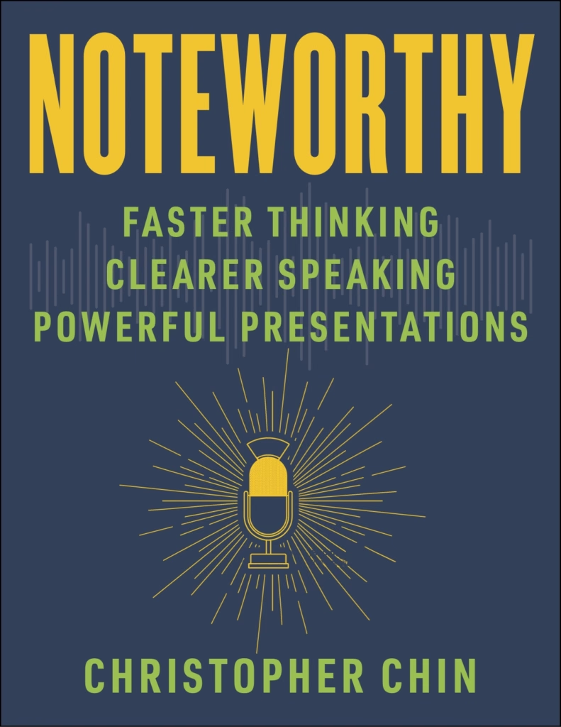
But to be certain, I asked my audience on LinkedIn … and their answers surprised me.
- They did not like the direction. They thought the darker covers were a bit outdated, a bit too science-y.
- But they loved the original cover with the megaphone!
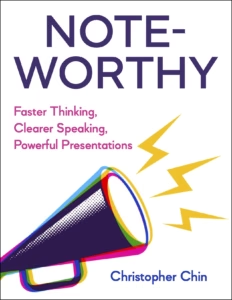
I took a step back. And realized they were right. The colors popped a lot better with the white background. And the megaphone clearly indicated the book’s theme … much better than the newer visuals did.
I decided I needed to stop, reset, and figure out what I actually wanted to see.
Revision #3:
Starting from Scratch … Again
After a lot of thought and research, I mocked up a design of my own:
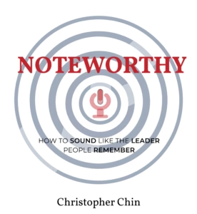
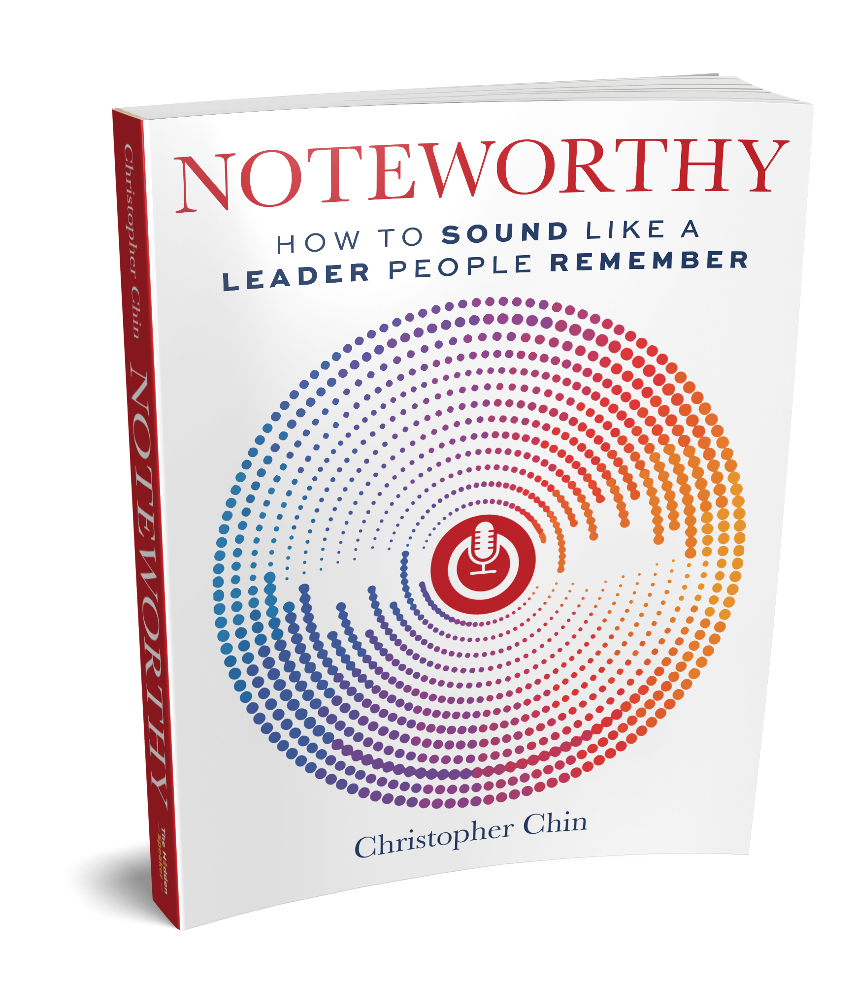
Evidently, nothing compared to a professional cover designer. But a great, hands-on way for me to explore my taste. I took inspiration from other books in the business, self-help, and leadership development genre, changing the title to a more elegant, traditional font, and changing the subtitle to start with “How to…” The visual was also my attempt at combining familiar elements in exciting new ways:
- The microphone in the center had sound waves coming out
- But I stylized it to look like the power button on a computer, making the whole image look like a gigantic power button (subliminally hinting at the power the reader receives from the lessons in the book)
After passing the mock-up along to my designer, he worked his magic and turned it into THE exact cover I’d been looking for:
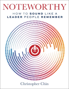
Sitting with the entire book completed on my computer – cover and all – I remember feeling a noxious mixture of relief and delightful apprehension. Soon, I was going to have the entire printed book in my hands … Soon, I was going to be an author!
The next step: marketing the book! Stay tuned for more updates 🙂
Follow me on LinkedIn for more updates on the book and its release!